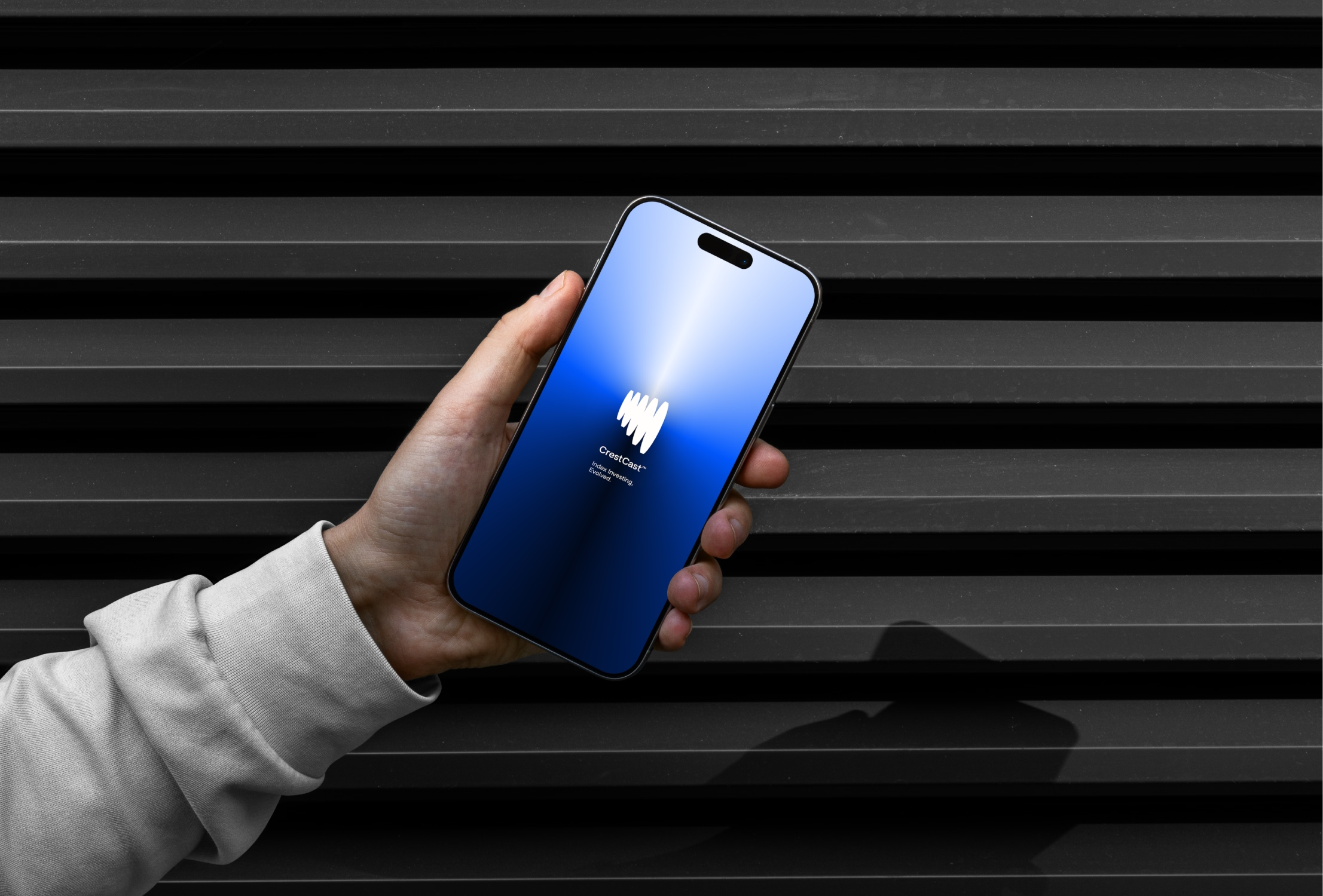
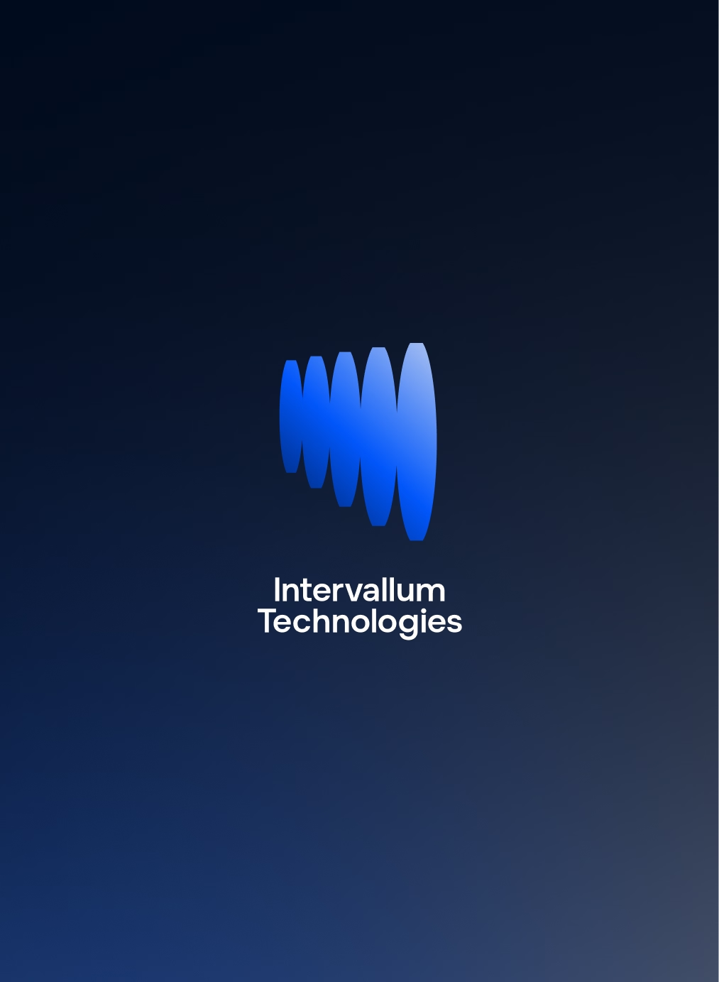
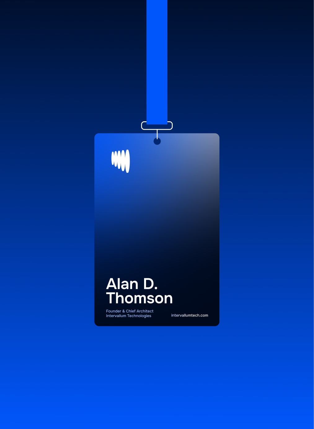
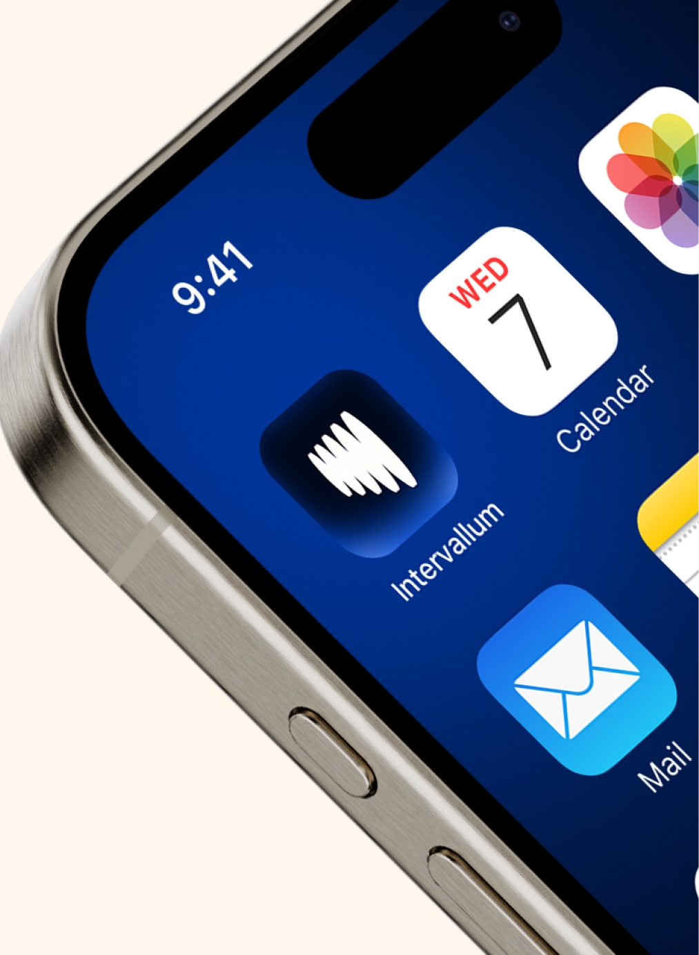
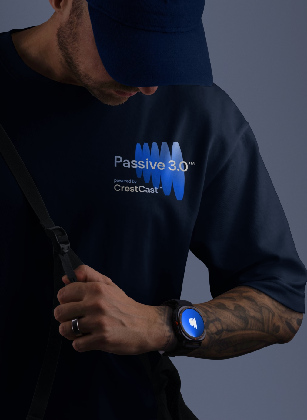
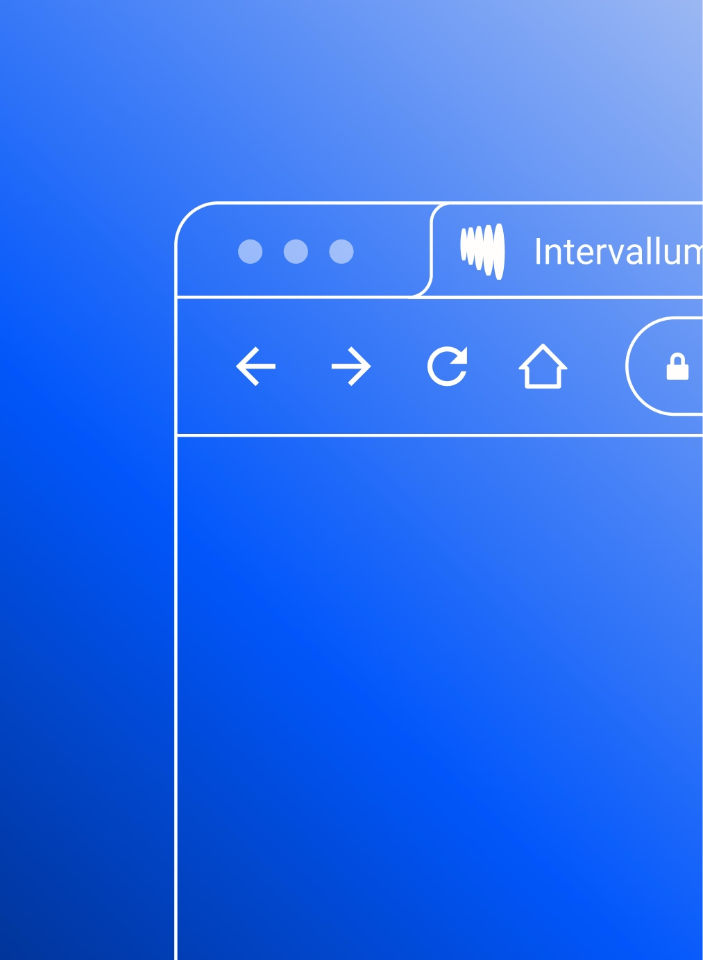
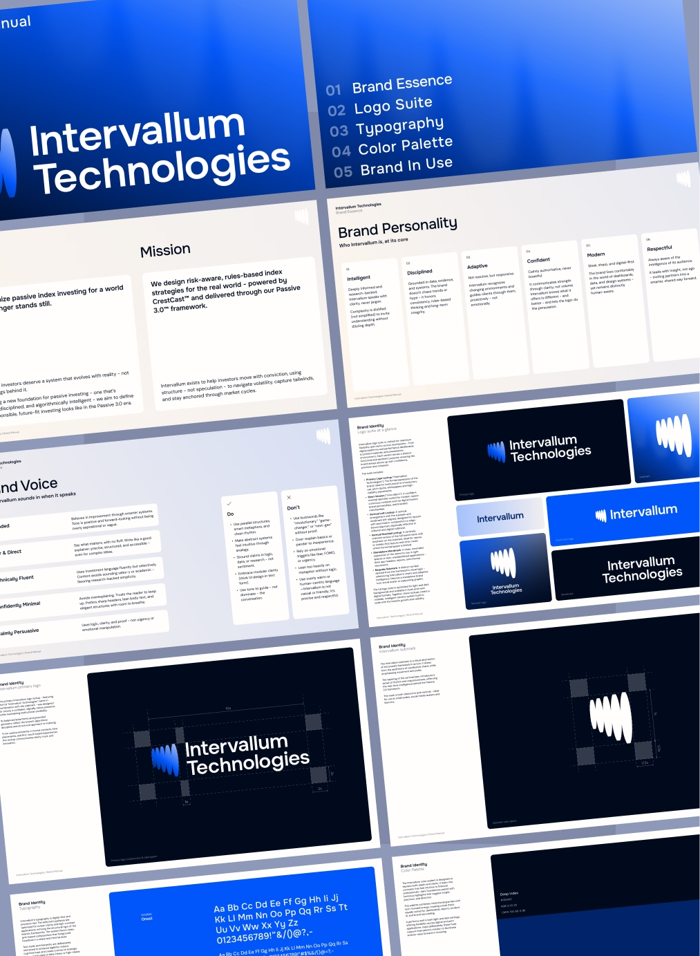
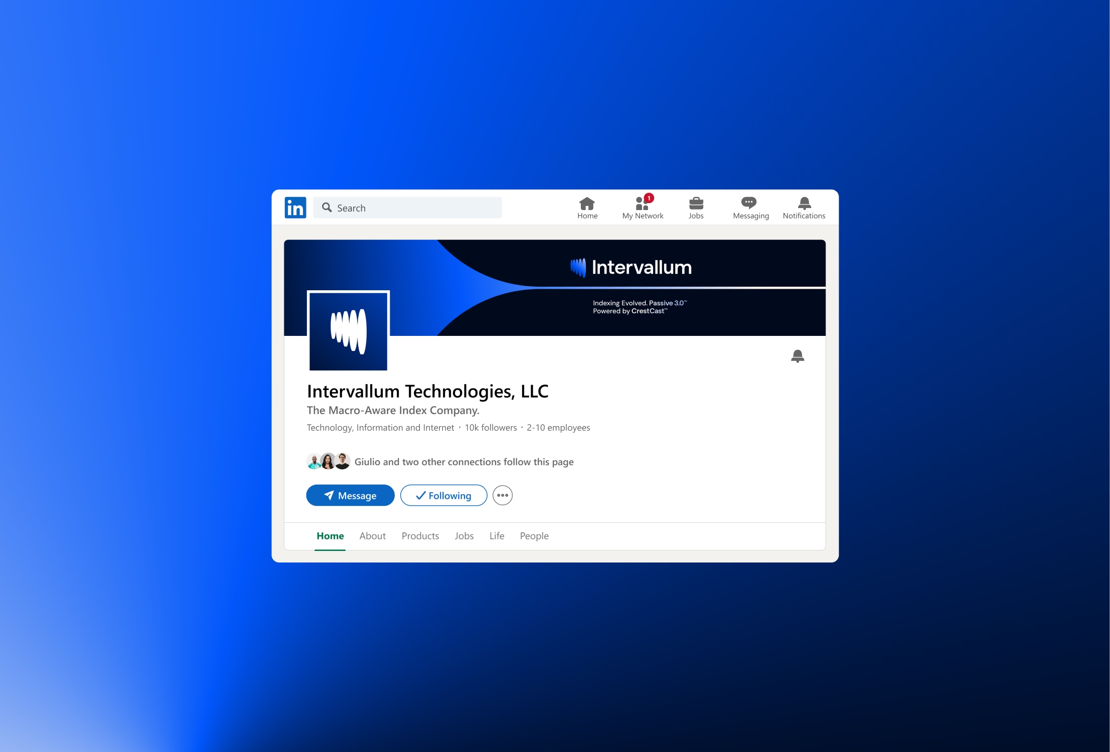
The brand direction leans into a dark-mode aesthetic with electric blue gradients, backlit elements, and crisp, digital typography - echoing the logic-driven nature of the product. Every detail was crafted to feel confident, intelligent, and precise. The logo suite, designed with modularity in mind, nods to technical charting patterns while staying abstract and timeless. The submark references candlestick patterns and downtrend signals - subtle, embedded cues that connect to CrestCast’s core mechanism. Typography and layout choices were guided by UI principles: strong hierarchy, clarity under scale, and seamless adaptability across screen-based formats. Color played a key strategic role - deep navy and charcoal tones conveyed institutional credibility, while luminous blues injected energy and innovation without sacrificing seriousness.
Tone of voice was developed in parallel with the visual system: calm, direct, and insight-driven. The verbal identity avoids hype, instead favoring clarity and confidence - matching the mindset of investors who value performance and transparency. From visual design to verbal precision, the brand identity was developed to position Intervallum as a credible force in financial innovation - ready for partner conversations, launch decks, and long-term evolution. All assets were delivered within weeks, with ongoing design support ensuring consistency and strategic growth as the platform expands.

.svg)