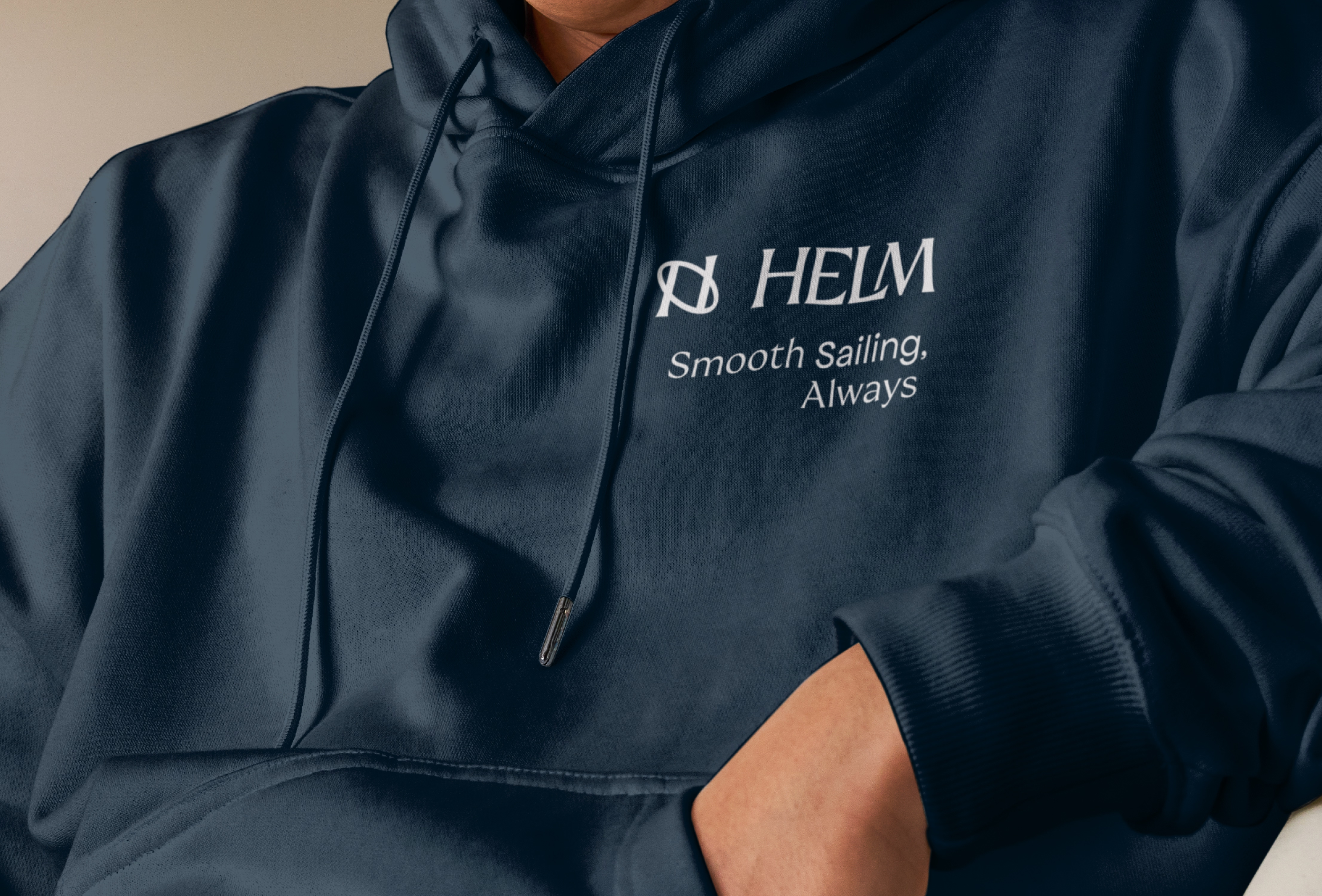
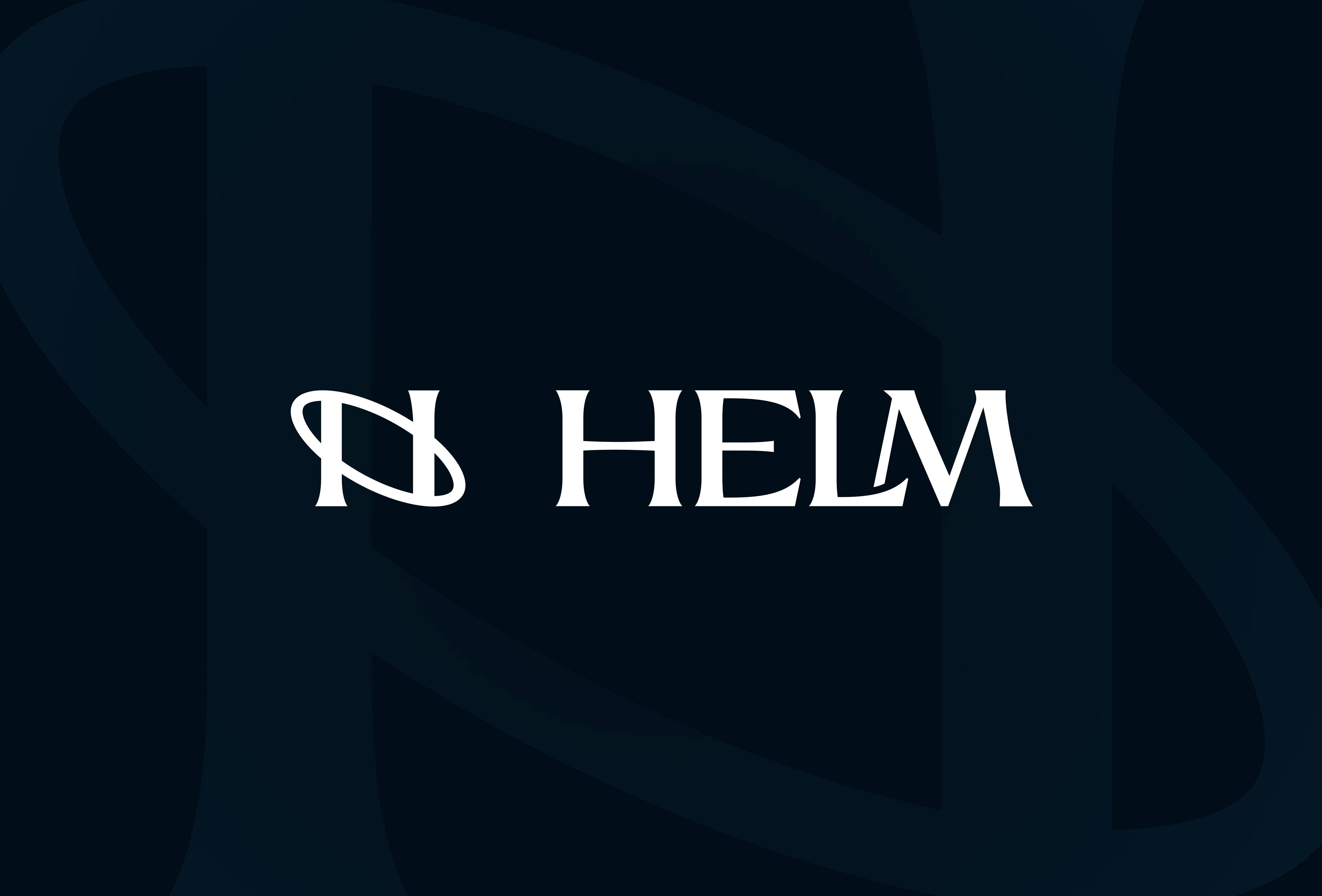
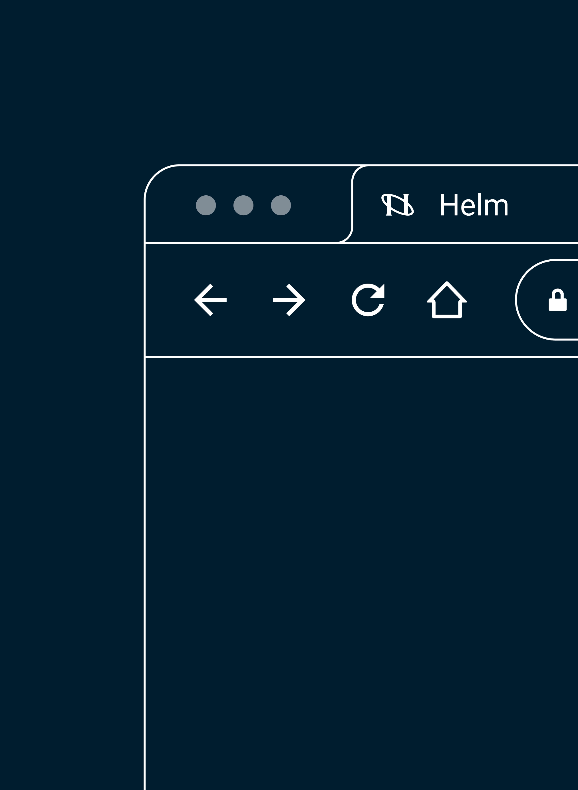
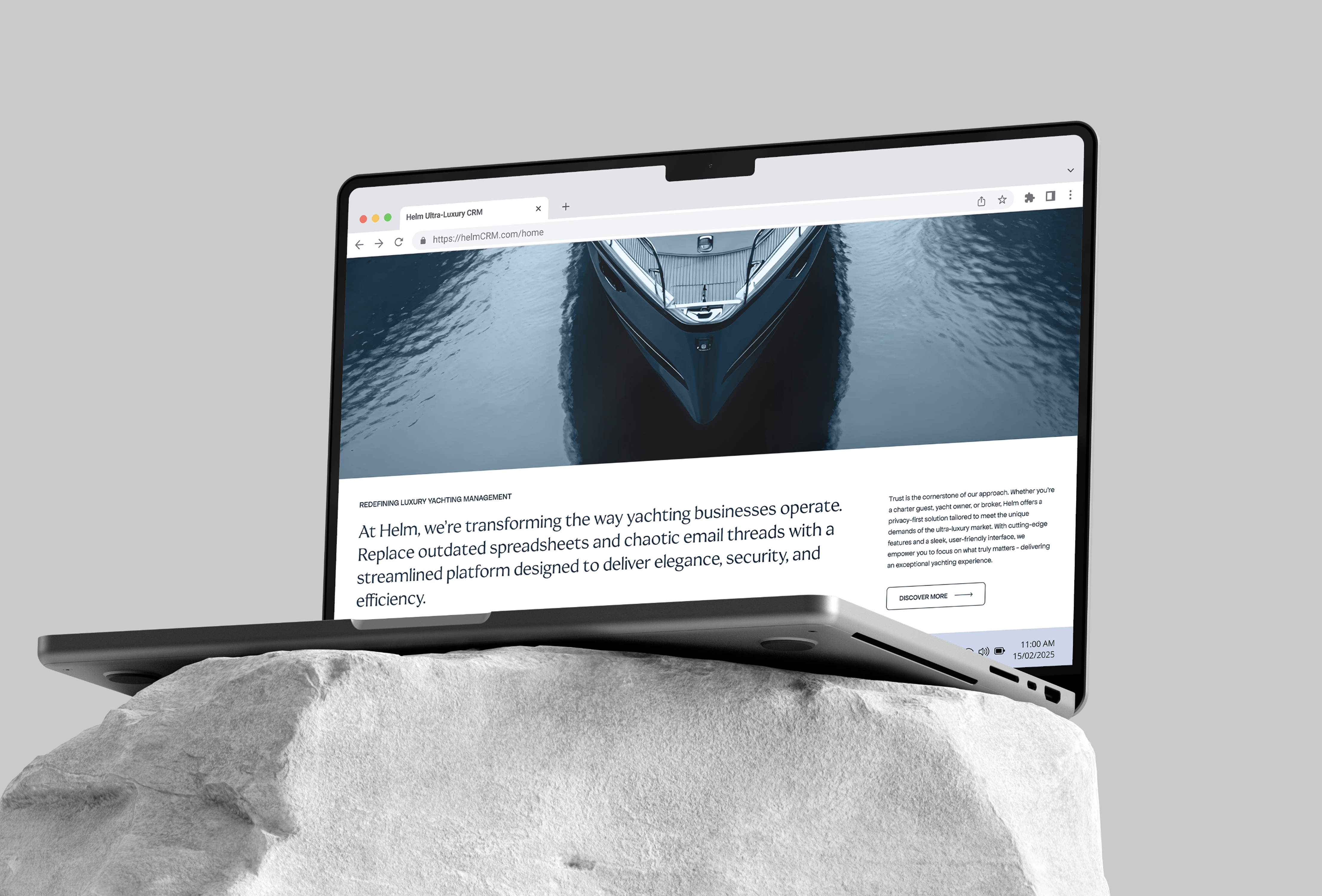
Every element of Helm’s visual language is crafted to mirror the calm control and fluid movement of luxury yachting. The custom wordmark draws directly from nautical references: an elegant flared “E” evokes the motion of a yacht cutting through water, while the subtly connected “L” and “M” create a sense of glide and rhythm. The submark reduces the identity to its core essence - a minimal looping ellipse enclosing vertical pillars. Together, they symbolize Helm’s smooth, rounded service model and its trusted foundational values. Designed with real-world use in mind, the submark adapts effortlessly across embroidered gear, app icons, and brand materials.
Helm’s color palette is anchored in deep marine tones - Midnight Current and Adriatic Blue - supported by crisp neutrals that lend balance and sophistication. Paired with a typographic system defined by extended, flared forms, the brand exudes calm authority, tailored precision, and timeless elegance. Every element of the identity is designed to feel natural, intuitive, and unmistakably Helm. Whether it’s making waves in the industry or operating quietly in the background, the brand is built to inspire trust and keep things running smoothly. Because at the end of the day, Helm is all about delivering confidence at the helm - ensuring smooth sailing, always.

.svg)

.avif)
.avif)
.avif)
.avif)
.avif)